3D Visualization Perspective for PDI 4
Introduction
The 3D visualization perspective is a plugin Spoon perspective for PDI >= 4.0 that provides a Java 3D-based 3D scatter plot visualization and a histogram matrix overview. Like the Agile BI plugins, it can be accessed from the contextual menu that appears when right-clicking over a Table output (or Table input) step in a transformation.
Requirements
- PDI version 4.0 or higher
- Java 3D - this is included on Mac OS X, but is a separate download for other operating systems. This must be installed before using the 3D visualization perspective for PDI. Java 3D can be obtained from: https://java3d.dev.java.net/binary-builds.html
Download
Binary or source archives can be obtained from the "List of Available Pentaho Data Integration Plug-Ins" wiki page.
Installation
- Make a "vis3D" subdirectory in the plugins/spoon directory of your PDI installation
- Make a "lib" subdirectory in "vis3D"
- Unpack the kettleScatterPlot.zip archive somewhere on your hard drive
- Copy vis3D.jar from "Vis3DDeploy" to plugins/spoon/vis3D in your PDI installation directory
- Copy the remaining jar files (dm-commons.jar, scatterPlot3D.jar and weka.jar) to plugins/spoon/vis3D/lib in your PDI installation directory
- Start Spoon
Usage
The 3D visualization will be activated when selecting the "Visualize 3D" menu entry from the contextual menu that appears when right clicking on a Table input or Table output step in a transformation. 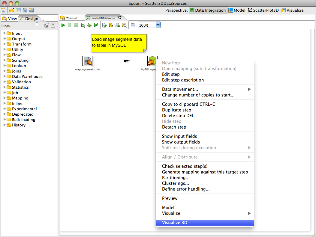
In this example, an image segmentation data has been loaded from a CSV file into a MySQL table which we will visualize.
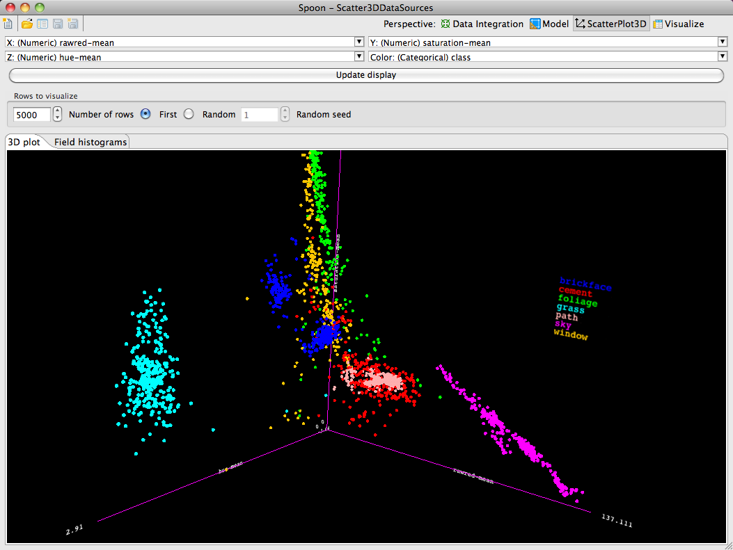
The user can select which dimensions to assign to each axis of the visualization from the drop down lists at the top of the perspective's UI. Furthermore, a fourth dimension can be used to color the points. Coloring can be based on categorical values (as in this example) or on a numeric variable (in which case a color gradient is used). After choosing dimensions for the axes and coloring, the display can be updated by pressing the "Update display" button.
The visualization can be rotated by pressing the left mouse button and moving the mouse. Zooming can be achieved by holding down the alt key while pressing the left mouse button and moving the mouse. Translation can be achieved by pressing the right mouse button and moving the mouse.
Because 3D visualization can be computationally intensive, the perspective provides built in sampling of the source data. The default settings visualize a maximum of the first 5000 points as read from the source database table. The user can adjust this using the widgets in the "Rows to visualize" panel of the UI. Furthermore, a random sample (reservoir sampling) can be taken by selecting the "Random" radio button.
A second visualization, available from the "Field histograms" tab, shows a matrix of histograms - one for each field/column in the data. If the coloring dimension is categorical then each bar in each histogram will be colored to show the relative proportions of the coloring field's values that occur in the range/value corresponding to the bar.