Trellis Chart
Trellis Chart
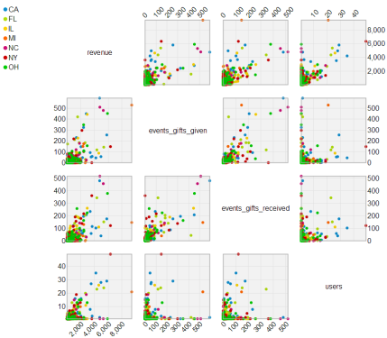 |
Relationship of Gifts Given/Received on Revenue |
The Trellis Chart is a layout of smaller scatter plot charts in a grid with consistent scales. Trellis Charts are useful for finding the structure and patterns in complex data. The grid layout looks similar to a garden trellis, hence the name Trellis Chart.
Get Started
Step 1: Download the plugin
- 12 Days visualization pack for Pentaho Business Analytics 5.4 - contains all 12 visualizations in a single plugin
- 12 Days visualization pack for Pentaho Business Analytics 5.1 up to 5.3 - contains all 12 visualizations in a single plugin
- 12 Days visualization pack for Pentaho Business Analytics 5.0 - contains all 12 visualizations in a single plugin
- Trellis chart plugin for Pentaho Business Analytics 4.8
Step 2: Follow the simple instructions for adding the plugin to your existing Pentaho BA Server
Step 3: Get Creative - explore your data, build cool stuff, amaze your friends and co-workers!
Disclaimer:
These visualizations are provided for demonstration purposes ONLY. They are provided with no warranty or commitments regarding the quality of the sample and/or platform support. Many of the underlying charting libraries used in these samples only work on a subset of browsers that are part of Pentaho's official support matrix.
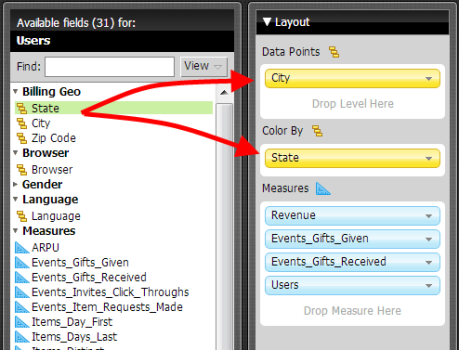
Working With Trellis Charts
 |
 | |
|
|
Tell Us What You Think
We're having lots of fun experimenting with various emerging visualization technologies and we would love to get your feedback. Here are a couple of ways you can share:
- Update the Trellis Chart enhancement ticket
- Post feedback about additional ideas for improvements
- Get out and vote! All of the visualizations we are sharing are prototypes which we can consider for inclusion in future GA releases of the Pentaho suite. Voting for an enhancement is a great way to influence the priority in which we 'product-ize' these visualizations
- Tweet about it - got feedback or a cool example you've created and want to share? Tweet your comments or screenshots to #12DaysOfViz
Known Limitations
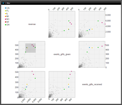
- Does not support tooltips, you can enable the ‘show Table’ option in the layout panel to display a summary of records selected
- Is not integrated with the Keep Only|Exclude|Clear Selections menu
- Does not support drill down
- Removing an attribute from the Color By shelf will cause the data points to disappear, you need to remove and re-add attribute(s) to the Data Points shelf
- Chart Properties for background colors and fonts can be tested, but they will not be applied when opening a saved report
- Measure names are displayed in all lower case within the Trellis chart
- Measure columns in the detail table contain extra <> characters
- The following chart properties are not integrated
- Axis range setting and scale
- All legend related settings