Chord Diagram
Chord Diagram
 |
 |
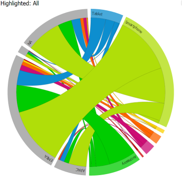
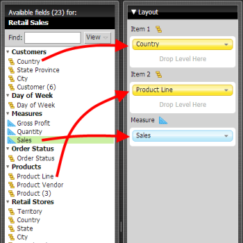
Product Line Sales by Country |
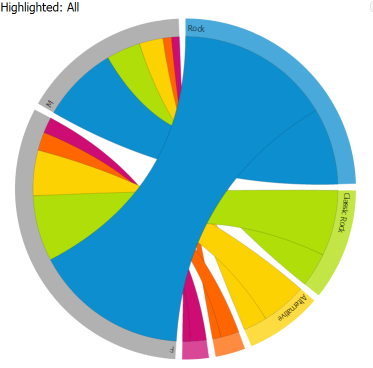
Music Sales by Gender |
Chord diagrams are useful for exploring relationships between groups of entities. They have been heavily adopted by the biological scientific community for visualizing genomic data, but they have also been featured as part of infographics in numerous publications including Wired, New York Times, and American Scientist.
Cool Examples Around the Web
Wired Magazine - chord diagram analyzing the relationships between characters in the TV series Lost.
American Scientist - chord diagram featured on the cover illustrating the sequencing of the dog genome.
New York Times - chord diagram illustrating the names dropped during presidential debates throughout the Democratic and Republican debates leading up to the 2008 election.
Get Started
Step 1: Download the plugin
- 12 Days visualization pack for Pentaho Business Analytics 5.4 - contains all 12 visualizations in a single plugin
- 12 Days visualization pack for Pentaho Business Analytics 5.1 up to 5.3 - contains all 12 visualizations in a single plugin
- 12 Days visualization pack for Pentaho Business Analytics 5.0 - contains all 12 visualizations in a single plugin
- Chord chart plugin for Pentaho Business Analytics 4.8
Step 2: Follow the simple instructions for adding the plugin to your existing Pentaho BA Server
Step 3: Get Creative - explore your data, build cool stuff, amaze your friends and co-workers!
Disclaimer:
These visualizations are provided for demonstration purposes ONLY. They are provided with no warranty or commitments regarding the quality of the sample and/or platform support. Many of the underlying charting libraries used in these samples only work on a subset of browsers that are part of Pentaho's official support matrix.
Working With Chord Diagrams
 |
 |
|
|
Tell Us What You Think
We're having lots of fun experimenting with various emerging visualization technologies and we would love to get your feedback. Here are a couple of ways you can share:
- Update the Chord Diagram enhancement ticket
- Post feedback about additional ideas for improvements
- Get out and vote! All of the visualizations we are sharing are prototypes which we can consider for inclusion in future GA releases of the Pentaho suite. Voting for an enhancement is a great way to influence the priority in which we 'product-ize' these visualizations
- Tweet about it - got feedback or a cool example you've created and want to share? Tweet your comments or screenshots to #12DaysOfViz
Known Limitations
- This visualization is based upon D3, which may not work with older versions of Internet Explorer
- Tooltips in Chrome are applying the wrong format mask to percentages (ie 7688973%)
- Tooltips in Firefox don't work at all